|


Welcome to the 178th edition of The Week in Polls (TWIP), which should start with me catching up on some welcome news from YouGov. Earlier this year they updated the terms and conditions on their website, following my highlighting of their unusual requirements. This newsletter therefore no longer needs to include a 2018 copyright credit for the firm. Thank you, YouGov Towers. (For those interested in unusual website T+Cs, 14 years ago I ran into a similar situation with Ipsos.)
Next comes a summary of the latest national voting intention polls, seat projections from MRPs and the most recent party leader ratings.
Subscribers who pay for the full edition can also read ten insights from the latest polling and analysis. These include:
How the “island of strangers” speech backfired for Labour;
How Labour and Conservative supporters have increasingly different views on how the country’s economy is going; and
An intriguing finding on how question wording impacts support for particular policies.
If you are not yet a paying subscriber, you can read all the answers by starting a free trial now:
This weekend’s raised eyebrows came courtesy of the Daily Telegraph which managed to combine this headline:
Britain’s white working-class young men are flocking to Reform
with, a long way down the piece, finally giving us some data that said otherwise:
Young people today are still far more likely to vote Labour, Green or even Lib Dem than Reform.
Granted, the piece makes some fair points about possible risks with polling accuracy and how things may change in future. But the headline makes a bold claim about something happening right now, when the rest of the piece then presents polling that doesn’t justify that claim. (And one of the people quoted in the post doesn’t seem to agree with the conclusion drawn either.)
And with that, on with the show.
Want to know more about political polling? Get my book - Polling UnPacked: the history, uses and abuses of political opinion polling.
Is The Times’s headline about global warming backed up by the facts?
The Times’s headline was very clear earlier this week:
Revealed: Global warming exaggerated, say soaring number of Britons
Nor was this just a case of headline exaggeration. For the opening paragraph added:
The number of Britons who think the dangers of global warming have been exaggerated has jumped by more than 50 per cent in the past four years, new research for The Times reveals.
But does it stand up when we dive into the data in the story that followed? Let’s find out.
There is to the careful reader, particularly the reader attuned to the problems with science stories in the media, a warning clue in that opening paragraph.
It is a staple of poor science reporting to run headlines like “Eating X DOUBLES risk of cancer”, when the underlying data is that the doubling is a move from 1 in 100 million to one in 50 million. A doubling, yes, but also a doubling that leaves eating X much less worrisome than the headline claims. (These sorts of stories are a large part of the explanation for Russell Howard’s Daily Mail cancer song.)
That “50 per cent increase” could be, say, a rise from 40% to 60% or a rise from 2% to 3%. Same proportionate increase, very different scenarios.
Reading on, then, we find that the 50 per cent increase is a rise from 16% to 25% (between, to be fair, comparable YouGov polls from 2021 and 2025). There are still 61% who say they have not been exaggerated, down from 68%. A seven point decline, yes, but I think it’s fair to say a rather different picture from the one the opening paragraph tempts you to believe.
Moreover, if we take other YouGov data, rather than only the two data points used in the story, we get a very different picture, as Will Jennings pointed out:
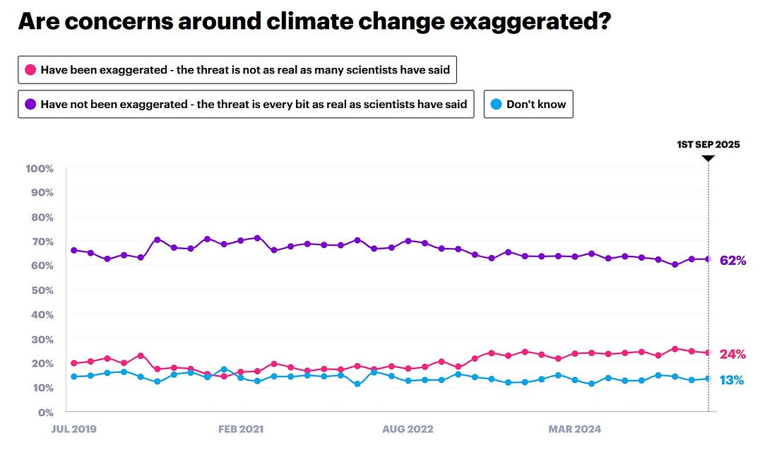 |
This is a graph without a dramatic declining trend. There was, perhaps, a slight bump up in the figures around 2020 that has since faded, but we’re in no very different place from where we were in 2019.
Steve Akehurst, whose polling analysis often features in TWIP, also chimed in:
Somewhat sensationalist headline here obscures some really interesting research - which tallies with other available tracking data - on shifting attitudes to climate in the UK.
Firstly, worth saying that majority of the country is still behind Net Zero - and the government's electoral coalition especially. Anti-NZ sentiment is not moving people from eg Lab to Reform.
All that said - you can see things have become sharply polarised by party.
Indeed in terms of outright hostility, evidence is v clear this is only happening among 'right bloc' voters- Con/Reform switchers especially - & has happened since GE24. This is both partisan sorting + right wing media hostility cutting through to these base voters, I'd guess.
With more mainstream voters, the issue is not outright hostility or denialism or crankery but falling issue salience, as the Times piece notes. It is *way* down ppls priorities vs 2021.
Even progressive/activist base energy has gone elsewhere (eg Gaza).
As he indicates, there is some good analysis further down the piece (and Luke Tryl has a handy thread adding more nuance to the rest of the piece). But the headline and opening paragraph matter, especially in a world of social media and paywalled news sites.
And those? They don’t stack up with the evidence that comes later in the piece or the evidence that we have from elsewhere.
If you spot a factual error…
Borrowing an idea from Stuart Ritchie and others, if you spot a factual error in an edition of this newsletter, I will give you 12 months free subscription to the paid-for version of this newsletter (or an extra 12 months on your existing one). Factual rather than grammatical errors, and factual errors rather than disagreements over interpretation. Though messages about both of those are always very welcome.
Voting intentions and leadership ratings
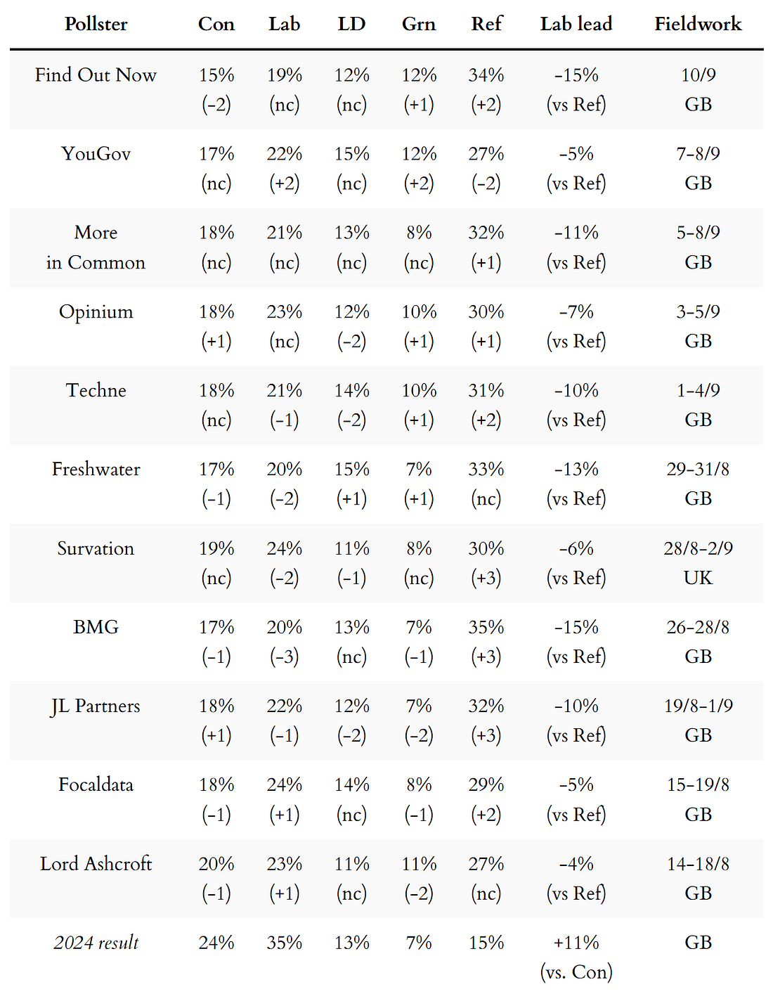
Here are the latest national voting intention figures from each of the pollsters currently active.
Several times recently I’ve highlighted that a couple of polls have suggested a possible big move for a party… but then as other polls have come in, the situation has settled down again. It is though notable that Find Out Now looks to have returned to being a regular outlier on the size of Reform’s lead even though other pollsters do at times flirt with similar numbers.
 |
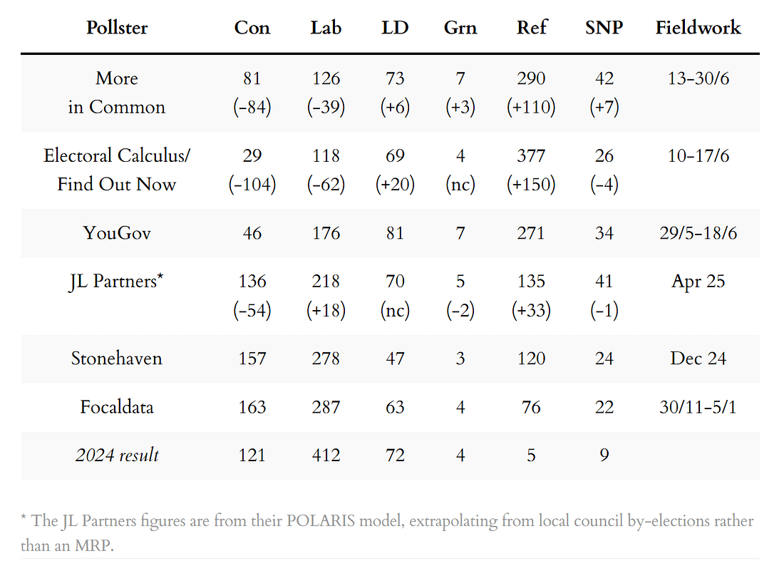
Next, the latest seat projections from MRP models and similar, also sorted by fieldwork dates. As these are infrequent, note how old the ‘latest’ data is.
 |
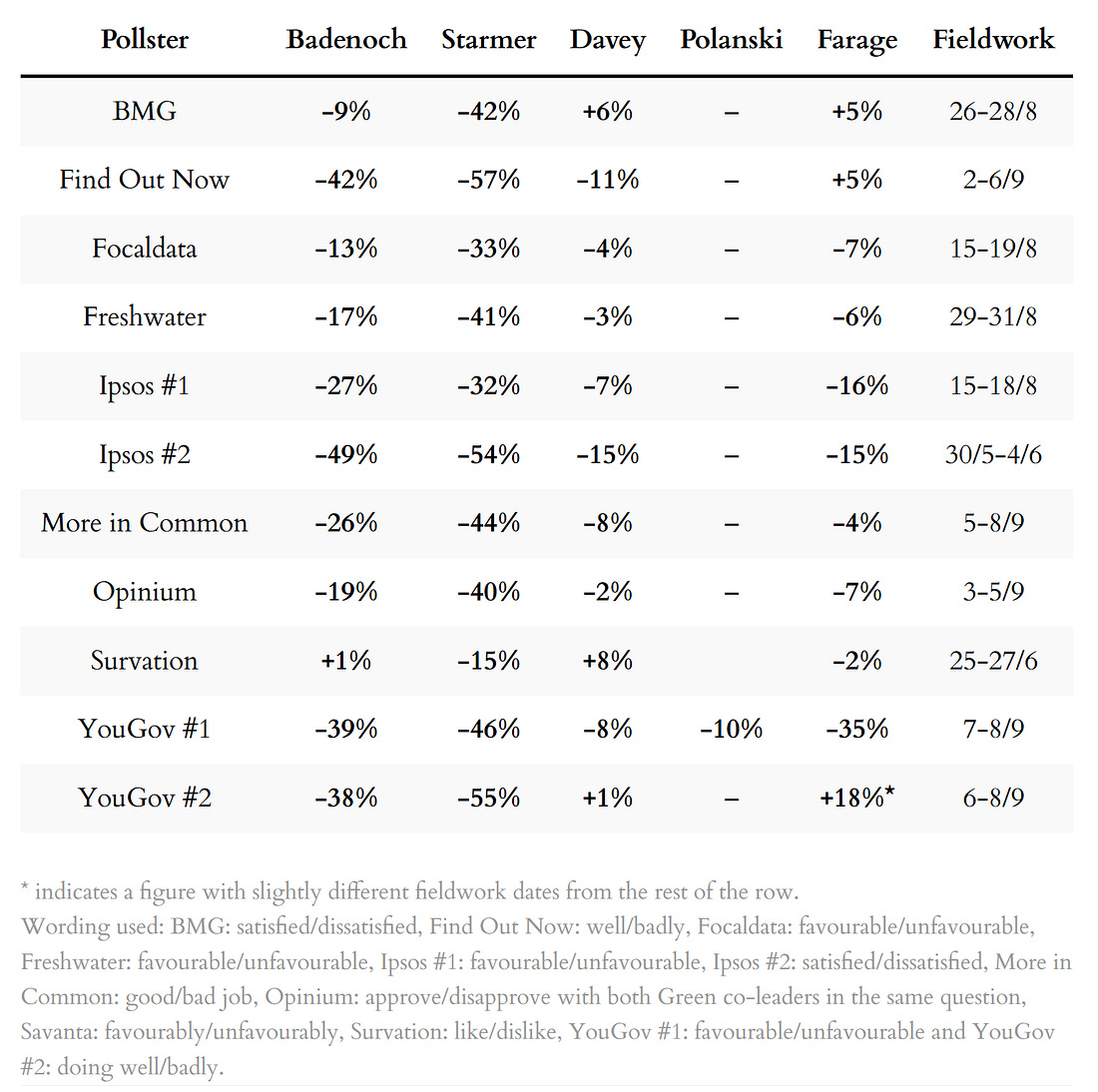
Finally, a summary of the latest leadership ratings, sorted by pollster name:
 |
For more details, and updates during the week as each new poll comes out, see my regularly updated tables here and follow The Week in Polls on Bluesky.
For the historic figures, including Parliamentary by-election polls, see PollBase.
Catch up on the previous two editions
 |
|
 |
|
My privacy policy and other legal information are available here. Links to purchase books online are usually affiliate links which pay a commission for each sale.
Quotes from social media messages are occasionally lightly edited for punctuation and clarity.
If you are subscribed to other email lists of mine, please note that unsubscribing from this one won’t automatically remove you from the others. If you wish to be removed from all my lists, simply reply to this email to let me know.
How Reform is doing worse than UKIP, and other polling news
The following 10 findings from the most recent polls and analysis are only for subscribers who pay for the full edition, but you can sign up for a free trial to read them straight away.
Marios Richards has been crunching British Election Study data since 2014...

Continue reading this post for free in the Substack app
| ||||||||||

