|


Welcome to the 167th edition of The Week in Polls (TWIP) and a warm welcome to everyone who joined after last week’s fact checking of part of the new Adam Curtis documentary, Shifty. Thank you also to existing readers who shared the newsletter with others. Between the two groups, you took this TWIP’s subscriber numbers over an arbitrary but pleasing round number.
Thank you also to YouGov’s Patrick English for answering my queries about small vote share differences between their new MRP model as published on their website (of which more below) and the data tables later produced.¹
Even more thanks also to those who mentioned that the BBC’s More or Less show also did a fact check of the same part of the documentary. The BBC even deployed The Curtice. If you want to compare fact checks, take a listen here.
For this week, there is still a Professor Sir John Curtice connection as I am taking a look at new data from the British Social Attitudes survey (the BSA).
Then it is a summary of the latest national voting intention polls, seat numbers from the latest MRPs and a round-up of party leader ratings.
Those are followed by, for paid-for subscribers, 10 insights from the last week’s polling and analysis.
This time, those ten include a lesson drawn by Joe Twyman from having been a pollster for Change UK.
The Week in Polls often often draws on the work of those at UK universities, so a little thank you for me in return with a special offer for anyone with a .ac.uk email address: you can sign up for the paid-for version of this newsletter at half price:
And with that, on with the show.
Want to know more about political polling? Get my book Polling UnPacked: the history, uses and abuses of political opinion polling.
The BSA: what it does, and doesn’t, tell us
The British Social Attitudes (BSA) survey is one of the ‘gold standard’ pieces of polling-based research, run by the National Centre for Social Research and with Professor Sir John Curtice as one of the team.
It comes with a 16 page pdf setting out its technical details - which encompass a serious (and expensive and time consuming) push to get responses from those who do not usually respond to surveys: “Letters were sent to a random sample of addresses inviting up to two people per household to complete the survey online, with an option to be interviewed by phone if preferred.”
So it is well worth paying attention to, especially as it includes questions that have been asked regularly since the mid-1980s, providing long and comparable time series.
Its findings do come with a catch. But let us look at some of the findings from the first tranche of data now released from BSA 42. (More data from this edition of the BSA is due out later in the year.)
The BSA team highlights:
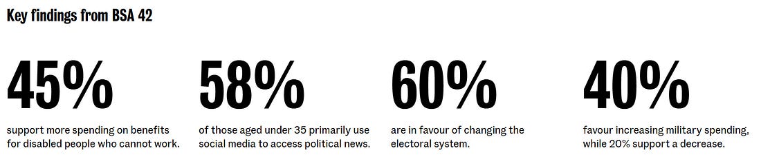 |
Some context for that 45% number:
For the first time less than half (45%) support more spending on benefits for disabled people who cannot work. But only 29% feel it is too easy to claim disability benefits.
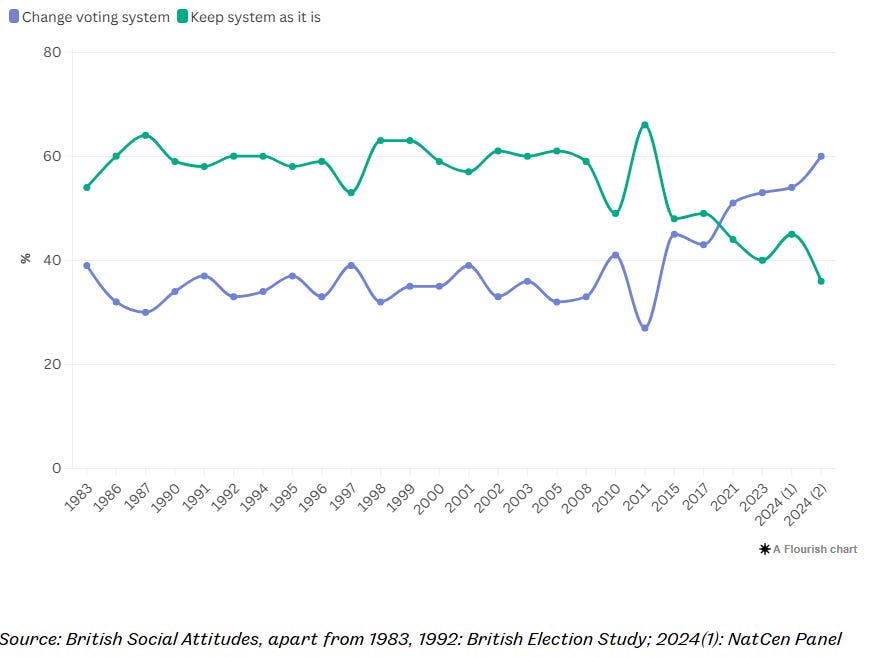
Of course, readers who know me will not be surprised that the 60% figure for electoral reform particularly caught my eye, especially as it is a record high:
 |
Also showing a distinctive recent pattern is another long time series:
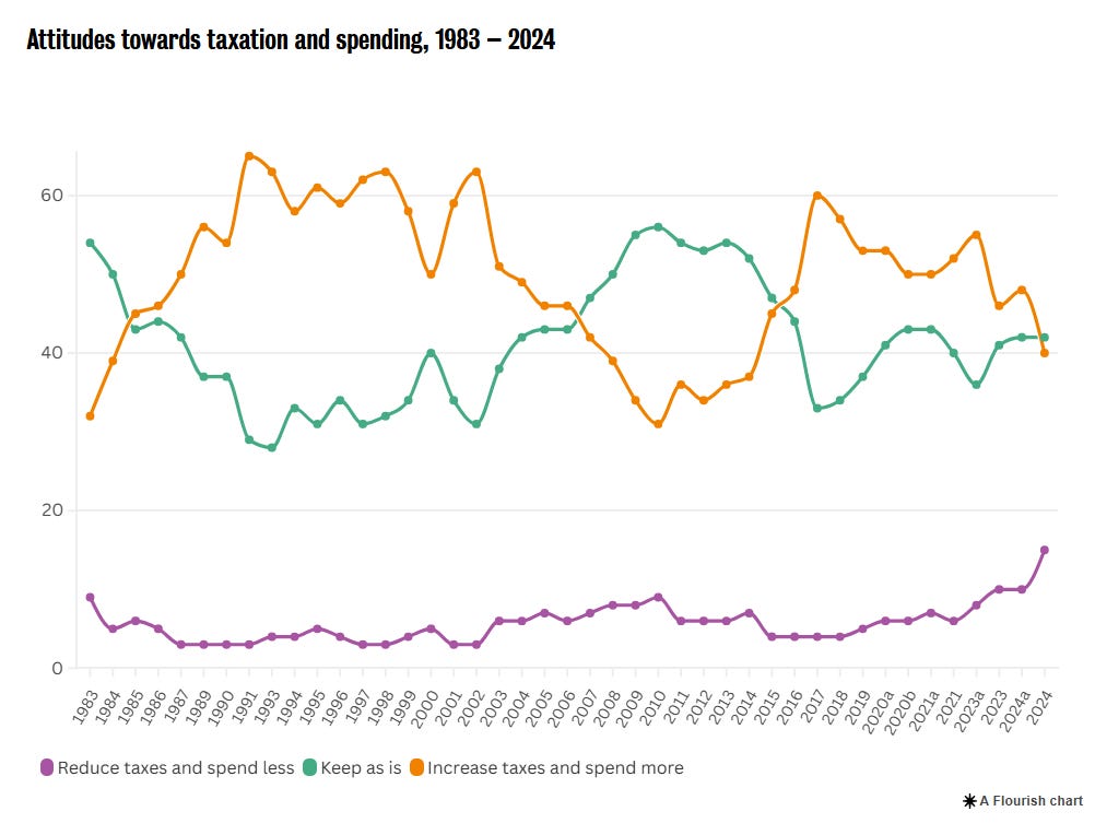 |
Note the steady decline over the last decade in people’s willingness to back increased taxes on this measure, and the rise in people wanting lower taxes with reduced spending.
But but but… here comes the caveat, best illustrated by that graph.
There is a generation of pollsters and politicians scared by the early 1990s part of the chart. There looked to be overwhelming support for higher taxes to pay for more public spending as the third term of a Conservative government came to its end leading into the 1992 general election.
The electoral verdict however, was a win for John Major and his attacks on Labour’s tax-rising plans. ‘Labour’s tax bombshell’ adverts had plastered billboards around the country.
There is a long story to tell about why the apparent strong support for raising taxes did not result in the tax rising party winning in 1992, which perhaps I will return to in a future edition. It did though leave a generation of poll readers not believing polls that say the public want taxes to raise.
What this graph therefore also shows is that there can be a big gap between the gold standard BSA data on the general public mood and having a vote winning position. That requires much more than just a simple matching of headline demands with the most popular points on the BSA graphs.
Back though to what the BSA data can tell us, this time with the NHS:
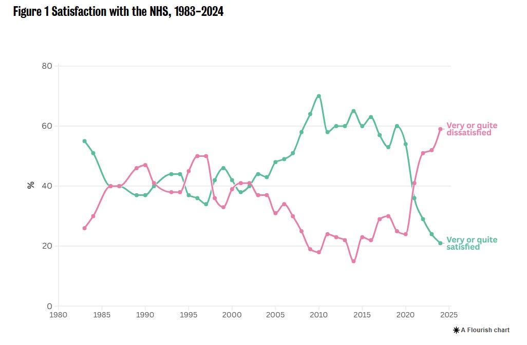 |
There is a lot of grim reading for Labour in the polls at the moment. This graph however reinforces my view that there is a straightforward - not easy, but straightforward - route to political recovery for Labour. It is to get growth going and to show that public services are starting to improve. Not an easy objective (!) but also one that is about broad policy success.
Labour’s political challenge isn’t one to be solved through clever segmentation and differentiated pitches. It is about simple, headline success at governing.
In other words, it is a Michael Barber, not a Morgan McSweeney, challenge.
The Guardian has covered another aspect of the BSA findings, reporting that:
Age and education have displaced class as the main demographic dividing line in British politics, according to a leading study on trends in public views …
The analysis found that in the 2024 general election, Labour did not reconnect with its traditional base of working-class voters, whose support dropped substantially in 2019. Among those in semi-routine and routine occupations, 30% voted Labour, compared with 42% of people in professional and managerial jobs…
The survey found that age and education were more often determining factors in voting intention. It said only 6% of 18- to 24-year-olds voted Conservative, compared with 36% of those aged 65 and over. Across age groups, just 5% of graduates voted for Reform UK, it found, compared with 25% of those with qualifications less than an A-level.
However, I think Ben Ansell has a better summary of what is happening:
Income has stopped being predicative of voting whereas education has become much more so.
What that means for the influence of class on voting depends therefore on how you view class.
And that is value judgement well beyond the ambit even of a gold standard survey such as the BSA.
Voting intentions and leadership ratings
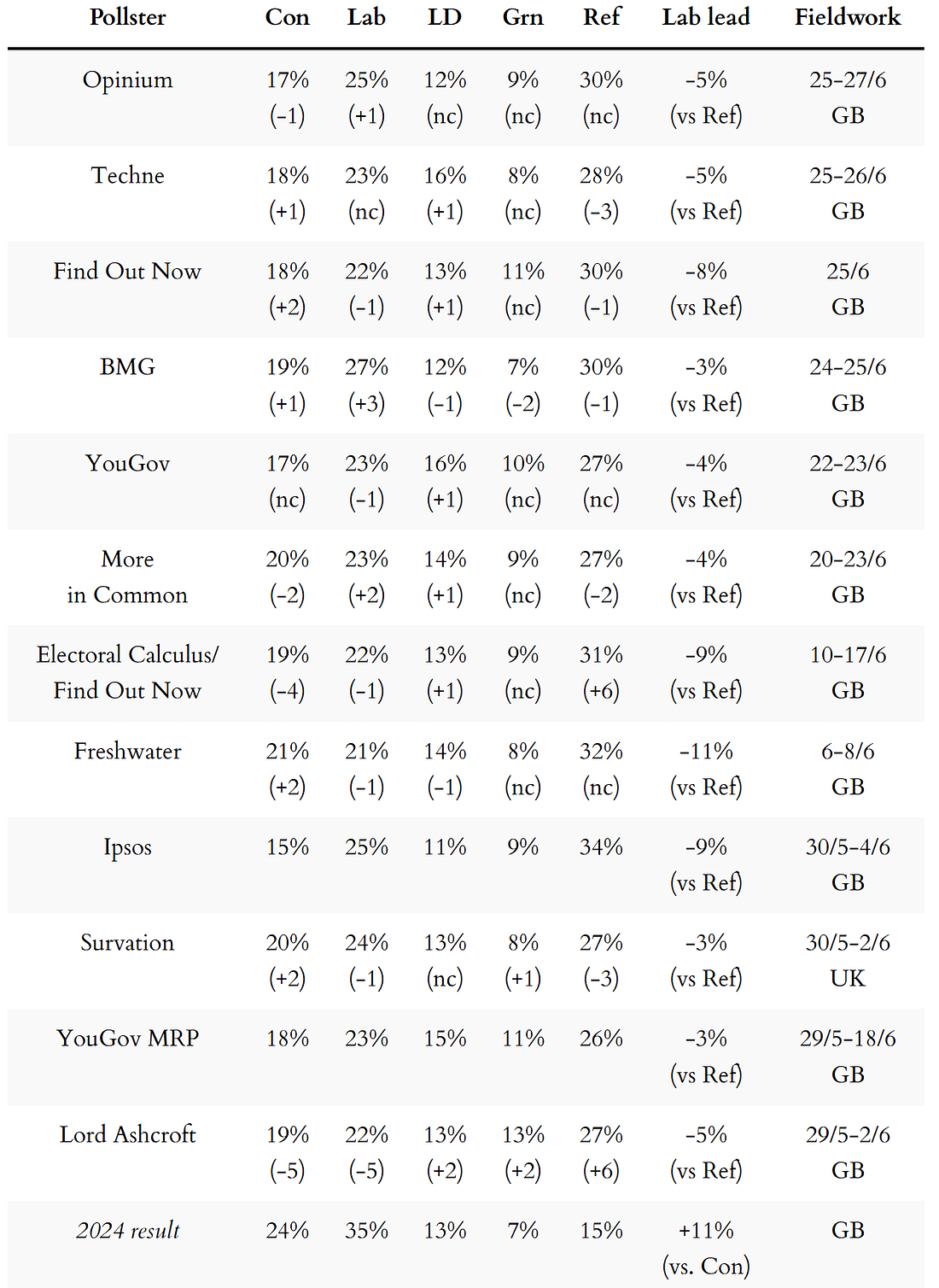
Here are the latest national voting intention figures from each of the pollsters currently active, including a return to voting intention polling from Techne after a little gap in their schedule of weekly tracking polls.
Freshwater Strategy, who I include below and wrote about earlier in the month, are now a member of the British Polling Council (BPC).
There has been enough data now over several weeks that we can say that Reform’s previous rise in the polls has definitely plateaued and there is a small sign of a recent dip.
 |
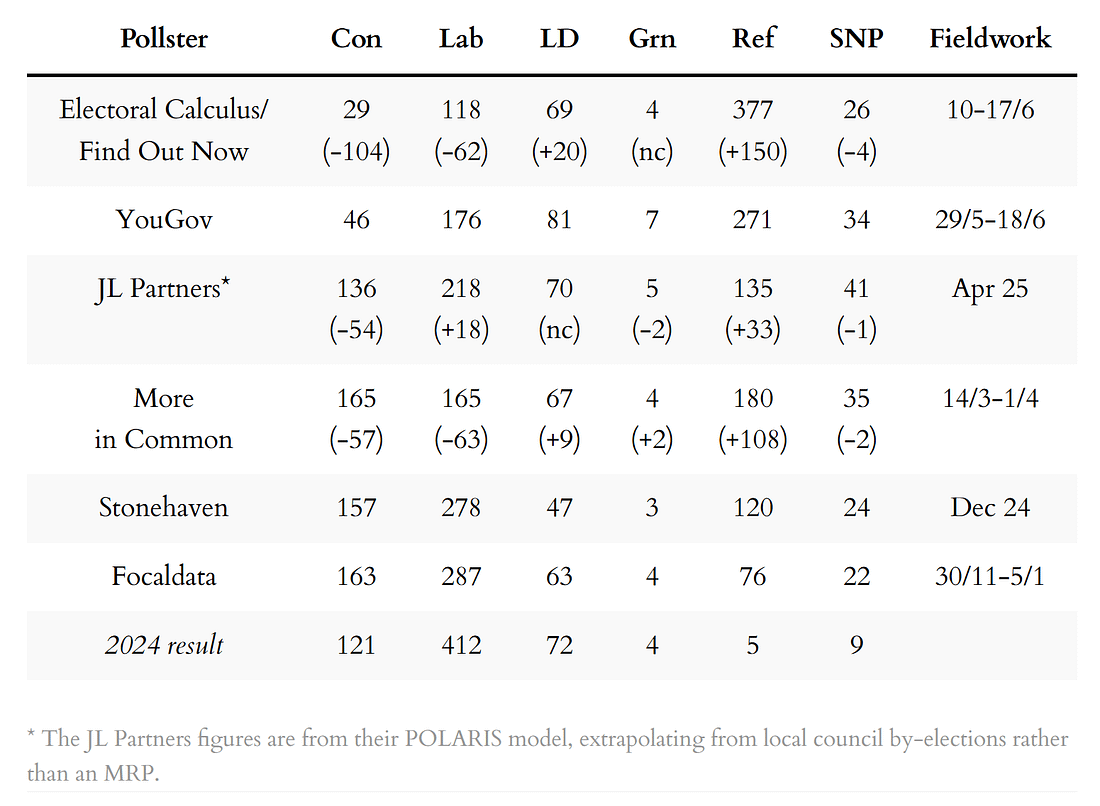
Next, the latest seat projections from MRP models and similar, also sorted by fieldwork dates.
These include the first YouGov MRP of this Parliament, of which the firm says:
Perhaps unsurprisingly, the new additions to the Reform UK [seats] column are almost exclusively constituencies which are estimated (by Professor Chris Hanretty) to have voted Leave in the 2016 EU referendum. Of these 266 Reform gains, just ten did not back Brexit: three in Scotland, two in Wales, and five in England.
The MRP shows many seats being won by small margins on low vote shares:
 |
Here then are the MRP figures, including also a new MRP from Electoral Calculus:
 |
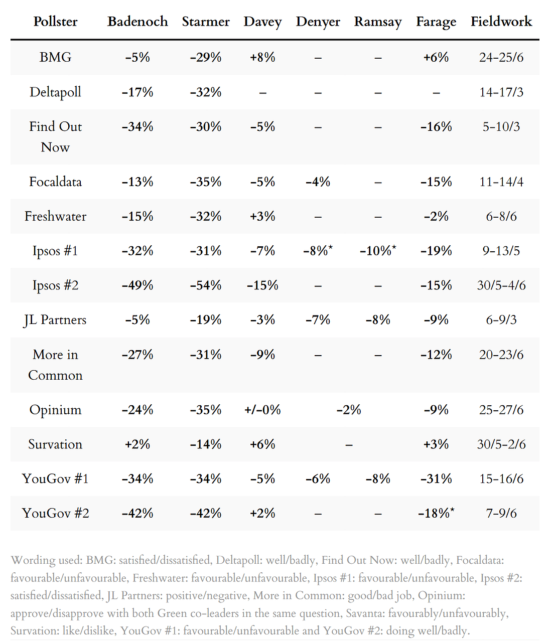
Finally, a summary of the the leadership ratings, sorted by name of pollster:
 |
For more details, and updates during the week as each new poll comes out, see my regularly updated tables here and follow The Week in Polls on Bluesky.
For the historic figures, including Parliamentary by-election polls, see PollBase.

Catch-up: the previous two editions
 |
|
 |
|
My privacy policy and related legal information is available here. Links to purchase books online are usually affiliate links which pay a commission for each sale. For content from YouGov the copyright information is: “YouGov Plc, 2018, © All rights reserved”.²
Quotes from people’s social media messages sometimes include small edits for punctuation and other clarity.
Please note that if you are subscribed to other email lists of mine, unsubscribing from this list will not automatically remove you from the other lists. If you wish to be removed from all lists, simply hit reply and let me know.
Is the polling for Corbyn as good as it looks?, and other polling news
The following 10 findings from the most recent polls and analysis are for paying subscribers only, but you can sign up for a free trial to read them straight away.
Polling by More in Common run by The New Statesman shows that a new Corbyn-...

Continue reading this post for free in the Substack app
| ||||||||||

